|
|
Central California - 31 October 2007, 03:04:54 UTC, Mw = 5.5 (BRK) The animation shows the vertical ground displacement in the 100-30s period range observed across the western United States by the EarthScope transportable array and generated by the 31 October, 2007 central California earthquake. Each circle represents a seismometer and the colors change to reflect variations in the signal amplitude crossing the array. Near the end of this animation you can see the waves that travel outward from the source roughly east of Monterey Bay). Linux users, please right-click here to download an ogg version of this animation. For some reason Safari wants to add a .txt suffix on the file when I do this, but the file name should end in .ogg. This animation contains a number of interesting features tha those from large teleseisms do not. The wavefronts expand outward roughly as circles (although the crust map projection affects how perfect the circle actually is). You can see two more subtle and interesting aspects of regional seismic waves in this animation.
For more information on the earthquake, here. A plot of the displacement seismograms used in the animation is shown near the bottom of this page. For the animation, I used displacement seismograms. If you have a problem viewing the animations: As I migrated from compression codec to compression codec, some of these files (the newer ones) require the DivX plugin for quicktime. So if you download a movie and try to run it in QuickTime, you may get a dialog box that directs you to a place to download and install a DivX plugin. Do that, it's free. Additional Animations:
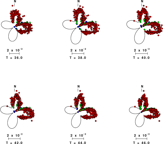
Surface-Wave Radiation PatternsRobert B. Herrmann from Saint Louis University has analyzed many of the regional data from the central California earthquake. One of the components of his analysis involves comparing the observed and expected amplitudes of surface waves. Here is a comparison I extracted from his web summary for this event. Rayleigh-wave amplitudes are shown on a polar display, the distance from the center of each plot represents the amplitude in cm-s, and the direction that the wave left the earthquake is shown on a geographic convention (north at the top). The period, T, is shown beneath each "radiation pattern" plot, along with the amplitude scale factor. The red circles are observed Rayleigh-wave amplitudes at each period, the lines are the predictions. The subtleties in the pattern reflect variations in the structure between the source and the receiver (and seismologists will use measurements of this type to explore the detailed earth structure beneath the TA).
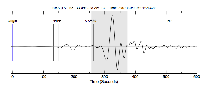
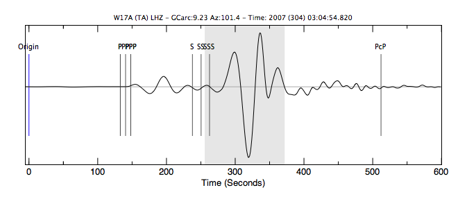
Observed and predicted Rayleigh-wave radiation patterns (courtesy of R. B. Herrmann, Saint Louis University) Waveform polarity examplesHere are two vertical component displacement waveforms that show the polarity reversal associated with the P and the Rayleigh waves. Each waveform was recorded about 9 degrees from the source, and about 45 degrees from the P and Rayleigh-wave node (about 56N). Upward motion on the seismogram indicates upward motion of the ground. The Rayleigh wave generates the motion in the gray-shaded region and you can see that it's the opposite in these two directions.
|