|
|
Near Wells, Nevada, USA - 21 February 2008, 14:16:04 UTC, Mw = 6.0 (GCMT) The animation shows the vertical ground displacement in the 100-20s period range observed across the western United States by the EarthScope transportable array and generated by the 21 February, 2008 Wells, NV earthquake. Each circle represents a seismometer and the colors change to reflect variations in the signal amplitude crossing the array. The ground motion begins near the source and then expands outward like a the waves from a pebble dropped in a pond. The circular wavefornts are distorted by the simple map projection used in the animation. The inital waves travel at about 8km/s, the larger amplitude waves that follow are moving at about 2.5km/s. This animation contains a number of interesting features tha those from large teleseisms do not. The wavefronts expand outward roughly as circles (although the crust map projection affects how perfect the circle actually is). For more information on the earthquake, here. A plot of the displacement seismograms used in the animation is shown near the bottom of this page. For the animation, I used displacement seismograms. If you have a problem viewing the animations: As I migrated from compression codec to compression codec, some of these files (the newer ones) require the DivX plugin for quicktime. So if you download a movie and try to run it in QuickTime, you may get a dialog box that directs you to a place to download and install a DivX plugin. Do that, it's free. Additional Information:
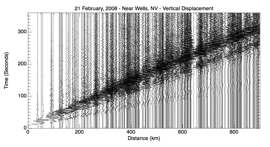
Seismic Record SectionsThe signals have been filtered to include ground vibrations with a period range of about 100 to 20 seconds (the same as used in the animation). Open the image in new window to see a larger version of the plot.
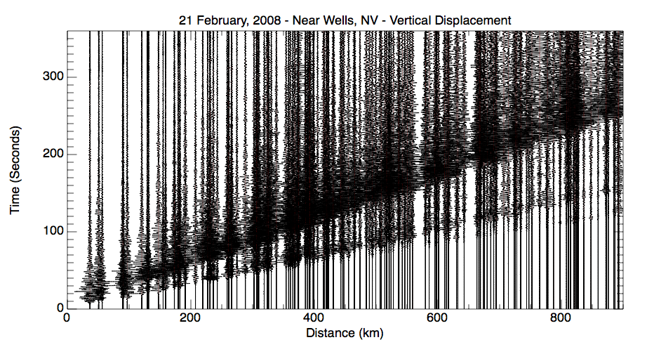
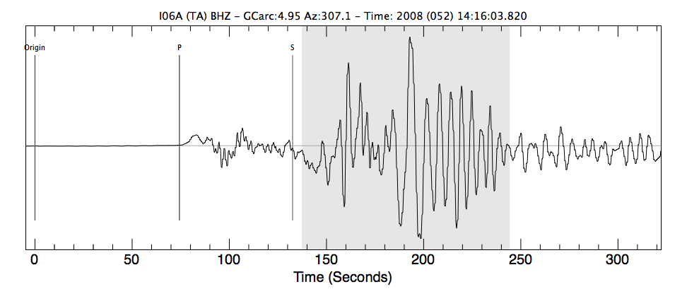
The signals have been filtered to include ground vibrations with a period range of about 3 to 0.3 seconds, those in the range normally fellt by people and within the range that produces damage. Open the image in new window to see a larger version of the plot. Here's a sample seismogram from a seismic station located about 550 km from the earthquake. The plot shows the vertical motion of the ground as a function of time. The peak displacement was about 600 microns. This signal is not filtered.
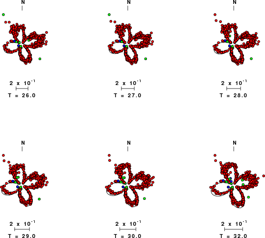
Open the image in new window to see a larger version. Surface-Wave Radiation PatternsRobert B. Herrmann from Saint Louis University has analyzed many of the regional data from the Wells, Nevada earthquake. One of the components of his analysis involves comparing the observed and expected amplitudes of surface waves. Here is a comparison I extracted from his web summary for this event. Love-wave amplitudes are shown on a polar display, the distance from the center of each plot represents the amplitude in cm-s, and the direction that the wave left the earthquake is shown on a geographic convention (north at the top). The period, T, is shown beneath each "radiation pattern" plot, along with the amplitude scale factor. The red circles are observed Rayleigh-wave amplitudes at each period, the lines are the predictions. The subtleties in the pattern reflect variations in the structure between the source and the receiver (and seismologists will use measurements of this type to explore the detailed earth structure beneath the TA).
Observed and predicted Love-wave radiation patterns (courtesy of R. B. Herrmann, Saint Louis University) |