Scientific Visualization
The main focus here is scientific visualization.
Interactive Plotting Using Bokeh
This section is prepared for the Penn State Geoscience Computer Users Group and presented on 02/24/2016. Some examples are based on the Bokeh documentation (http://bokeh.pydata.org/).
You can download the Python Notebook that I used during the meeting here Download Notebook.
Install Bokeh (via Anaconda)
conda install bokeh
Why use interactive plotting?
- View Data or Model at Different Scales
- Visualize Changes in Data or Model
- Show Links Between Data Sets and Model
- Present High Demensional Results
Some Examples
Load Libraries
# Basic libaries
from bokeh.plotting import Figure, show, output_file
# Use to combine multiple figures
from bokeh.io import HBox, VBox
# For interactions
from bokeh.models import CustomJS, ColumnDataSource, Slider
# For data generation
import numpy as np
X-Y Plot
# some data points
x = [1, 2, 3, 4, 5]
y = [6, 7, 2, 4, 5]
# create a blank figure
p = Figure()
# plot a line
p.line(x,y, line_width=2)
# save to a html file
output_file('xyplot.html')
show(p)
Customize the Figure
x = [1, 2, 3, 4, 5]
y = [6, 7, 2, 4, 5]
# select tools
mytools = ['pan,wheel_zoom,box_zoom,reset,resize,save,crosshair']
# set up the frame
p = Figure(plot_width=800, plot_height=600, \
           tools=mytools, title='My Bokeh Plot')
# plot data
p.line(x,y, line_width=2, legend='Line')
p.circle(x,y,size=15,color='black',legend='Dots')
# add labels for axes
p.xaxis.axis_label = 'X'
p.yaxis.axis_label = 'Y'
# add legend
p.legend
# change fontsize for legend labels
p.legend.label_text_font_size = '10p'
# save to a html file
output_file('customized.html',title='Line Plot')
show(p)
Filled Contour
# generate some data points
N = 1000
x = np.linspace(0, 10, N)
y = np.linspace(0, 10, N)
xx, yy = np.meshgrid(x, y)
d = np.sin(xx)*np.cos(yy)
# set up the frame
p = Figure(x_range=(0, 10), y_range=(0, 10),\
           plot_width=800, plot_height=800)
# plot the image
p.image(image=[d], x=0, y=0, dw=10, dh=10, \
        palette='Spectral11')
# save to a html file
output_file('contour.html',title='Contour Plot')
show(p)
Slider Bar
Initial plot
# create some data points
x = [x*0.005 for x in range(0, 200)]
y = x
# save the data in a bokeh format
dataSource = ColumnDataSource(data=dict(x=x, y=y))
# set up the frame
plot = Figure(plot_width=800, plot_height=600)
# plot a line, use data from 'source'
plot.line('x', 'y', source=dataSource, line_width=3, line_alpha=0.6)
Add Interactions
# define interactions
callback = CustomJS(args=dict(source=dataSource), code="""
        var data = source.get('data');
        var f = cb_obj.get('value')
        x = data['x']
        y = data['y']
        for (i = 0; i < x.length; i++) {
            y[i] = Math.pow(x[i], f)
        }
        source.trigger('change');
    """)
# set up the slider bar
slider = Slider(start=0.1, end=4, value=1, step=.1, title="power", \
                callback=callback)
layout = HBox(VBox(slider, plot))
# save to a html file
output_file('sliderBar.html')
show(layout)
Linked Plots
Initial plot
# generate some data
x = np.random.uniform(0,1,500)
y = np.random.uniform(0,1,500)
# save into bokeh format
dataSet = ColumnDataSource(data=dict(x=x, y=y))
# plot left figure
leftFigure = Figure(plot_width=600, plot_height=600,
    tools="lasso_select", title="Select Here")
leftFigure.circle('x', 'y', source=dataSet, size=10, alpha=0.6)
# plot initial figure
selectedData = ColumnDataSource(data=dict(x=[], y=[]))
rightFigure = Figure(plot_width=600, plot_height=600, \
    x_range=(0, 1), y_range=(0, 1), tools="", title="Watch Here")
rightFigure.circle('x', 'y', source=selectedData, size=10, alpha=0.6
Add Interactions
# define the interaction
dataSet.callback = CustomJS(args=dict(sD=selectedData), code="""
        var inds = cb_obj.get('selected')['1d'].indices;
        var allData = cb_obj.get('data');
        var selectedData = sD.get('data');
        selectedData['x'] = []
        selectedData['y'] = []
        for (i = 0; i < inds.length; i++) {
            selectedData['x'].push(allData['x'][inds[i]])
            selectedData['y'].push(allData['y'][inds[i]])
        }
        sD.trigger('change');
    """)
# control the layout
layout = HBox(leftFigure, rightFigure, width=1600)
# save figures to a html file
output_file('linkedPlots.html')
show(layout)
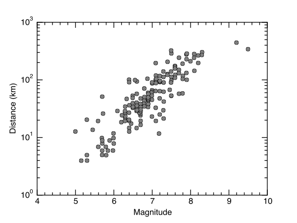
Plotting Data Using a Python Package - matplotlib
This section is prepared for the Penn State Geoscience Computer Users Group and presented on 11/04/2015. You may get the code and data (and examples from two other students) from this shared folder Link .
X-Y Plot
Import Packages and Set Plotting Parameters
import numpy as np
#%matplotlib inline #for python notebook
import matplotlib.pyplot as plt
from obspy import UTCDateTime
import datetime
plt.rcParams['xtick.labelsize'] = 12
plt.rcParams['ytick.labelsize'] = 12
plt.rcParams['font.sans-serif'] = 'Helvetica'
plt.rcParams['xtick.major.size'] = 8
plt.rcParams['xtick.minor.size'] = 4
plt.rcParams['ytick.major.size'] = 8
plt.rcParams['ytick.minor.size'] = 4
Load Data for X-Y Plot
data = np.loadtxt('liquefactionData.txt',skiprows=1)
x = data[:,0]
y = data[:,1]
Plot X-Y
fig = plt.figure(0,figsize=(6,4.5))
ax = plt.subplot(111)
ax.plot(x,y,'o',color='gray',markeredgecolor='black',alpha=1.0)
#ax.set_xlim(0,470)
ax.set_ylabel('Distance (km)',fontsize=12)
ax.set_xlabel('Magnitude',fontsize=12)
ax.minorticks_on()
ax.set_yscale('log')
plt.savefig('liquefaction.pdf')
Here is the result.
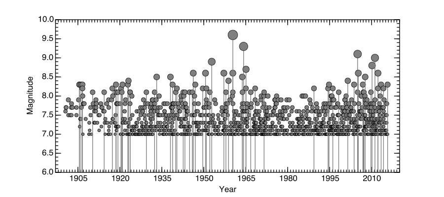
Date Plot
Load Data for Date Plot
eventTime, eventLat, eventLon = [], [], []
eventDepth, eventMag, eventMagType = [], [], []
eventPlace = []
fid = open('usgsLargeEQ-1900-2015.txt','r')
fid.readline()
for aline in fid:
    words = aline.split(',')
    eventTime.append(UTCDateTime(words[0]).datetime)
    eventLat.append(float(words[1]))
    eventLon.append(float(words[2]))
    eventDepth.append(float(words[3]))
    eventMag.append(float(words[4]))
    eventMagType.append(words[5])
    eventPlace.append(words[13])
fid.close()
# prepare data file for the map
fid = open('usgsLargeEQ-1900-2015-gmt.txt','w')
fid.write('      {0:12s} {1:12s} {2:12s} {3:12s} \n'.format('Lon','Lat',\
                                        'Depth','Mag'))
for i in range(len(eventLat)):
    fid.write('{0:12.4f} {1:12.4f} {2:12.4f} {3:12.4f} \n'.format(\
                eventLon[i],eventLat[i],eventDepth[i],eventMag[i]))
fid.close()
Plot Figure
from matplotlib.dates import YearLocator, MonthLocator, DateFormatter
from matplotlib.ticker import MultipleLocator
fig, ax = plt.subplots(figsize=(9,4.0))
for i in range(len(eventTime)):
    time = eventTime[i]
    mag = eventMag[i]
    size = mag**4/600
    if mag > 8:
        ax.plot_date([time,time],[5,mag],'gray',alpha=1.0,lw=1)
    ax.plot_date(time,mag,'o',color='gray',alpha=1.0,ms=size,\
                 markeredgecolor='black')
ax.set_ylim(6,10)
ax.set_xlim(datetime.date(1897,1,1),datetime.date(2020,1,1))
years = YearLocator(15)
ax.xaxis.set_major_locator(years)
years = YearLocator(1)
ax.minorticks_on()
ax.xaxis.set_minor_locator(years)
#
minorLocator = MultipleLocator(0.1)
ax.yaxis.set_minor_locator(minorLocator)
ax.set_ylabel('Magnitude',fontsize=12)
ax.set_xlabel('Year',fontsize=12)
plt.savefig('largeEQDate.pdf')
Here is the result.
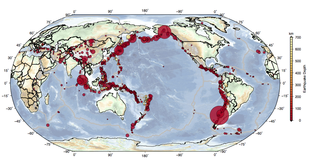
Plotting Earthquake Data on a Map Using GMT
This section is prepared for the Penn State Geoscience Computer Users Group and presented on 11/04/2015.
#!/bin/sh
gmt set FONT_ANNOT_PRIMARY 17p,Helvetica
gmt set FONT_LABEL 17p,Helvetica
gmt set PS_MEDIA 16ix8i
gmt set PROJ_LENGTH_UNIT p
out=`basename $0 .sh`.ps
#
PROJ=-JN13i
BOUNDS=-Rg0/360/-90/90
CPT=us.cpt
#
gmt psbasemap $PROJ $BOUNDS -K -B90/15 -P -Xc-0.5i -Yc > $out
# plot elevation using ETOPO1, requires topography data
#gmt grdimage ETOPO1_Bed_g_gmt4_01.grd -IETOPO1.grd -C$CPT $PROJ $BOUNDS -K -O -t50 >> $out
# plot plate boundaries, requires plate boundary data
gmt psxy $PROJ $BOUNDS PB2002_boundaries.gmt -W2p,gray -Sf2.25/12p -K -O >> $out
# plot coast lines and political boundaries
gmt pscoast $PROJ $BOUNDS -W1p -Dl -N1/2p -A50000 -K -O >> $out
#
gmt makecpt -Cseis -T-100/700/10 -D > temp.cpt
# plot earthquakes
gmt psxy $PROJ $BOUNDS pltTemp.txt -Sc -Ctemp.cpt -K -O -W0.1p -t20 >> $out
#
# plot colorbar
gmt psscale -D13.7i/3.5i/4i/0.1i -Ctemp.cpt -E -Ba100g20:"Earthquake Depth":/:km: -G0/4500 -K -O >> $out
ps2pdf $out
outpdf=`basename $0 .sh`.pdf
Here is the result.